|
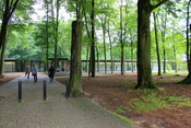
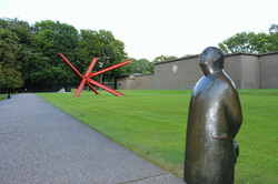
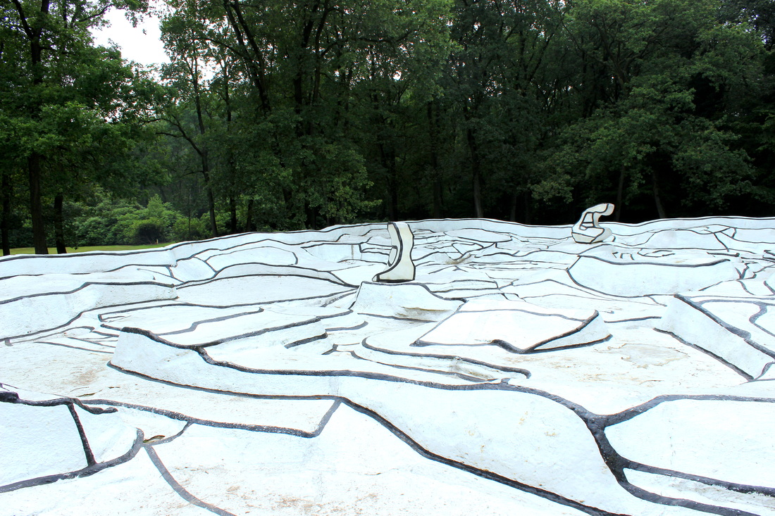
This is about why I went into science communication. It's also about why I studied science. And about why I feel so passionately about visual art. It's all of those things, because I think they come from the same place. On my birthday, I went to Hoge Veluwe National Park in the Netherlands. The park is a beautiful amalgamation of rough green heathland and distant tree copses, red-barked pines and savannah grasslands, African desert dunes and twisted silvered trees. I cycled through and marvelled at how the land changed as I went further in.
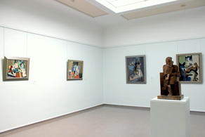
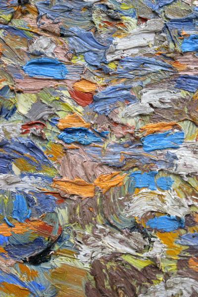
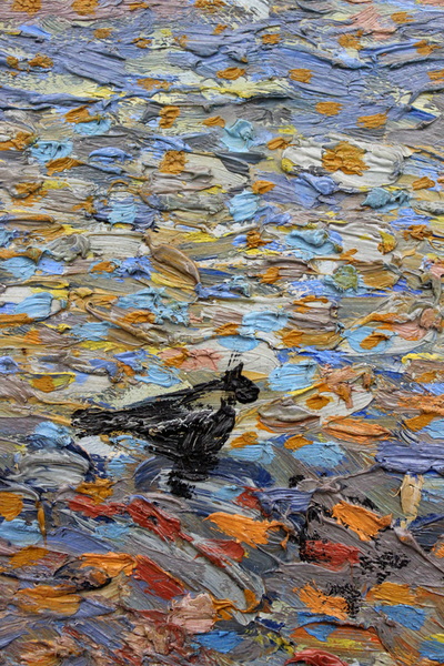
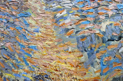
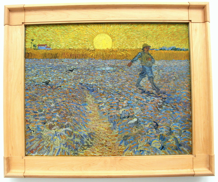
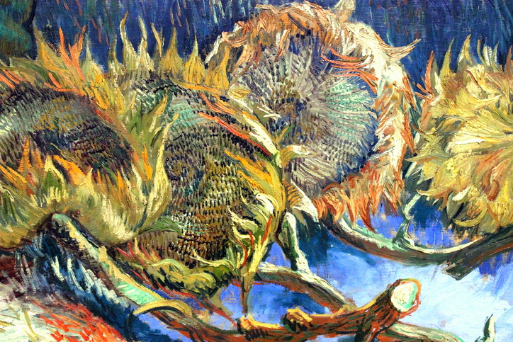
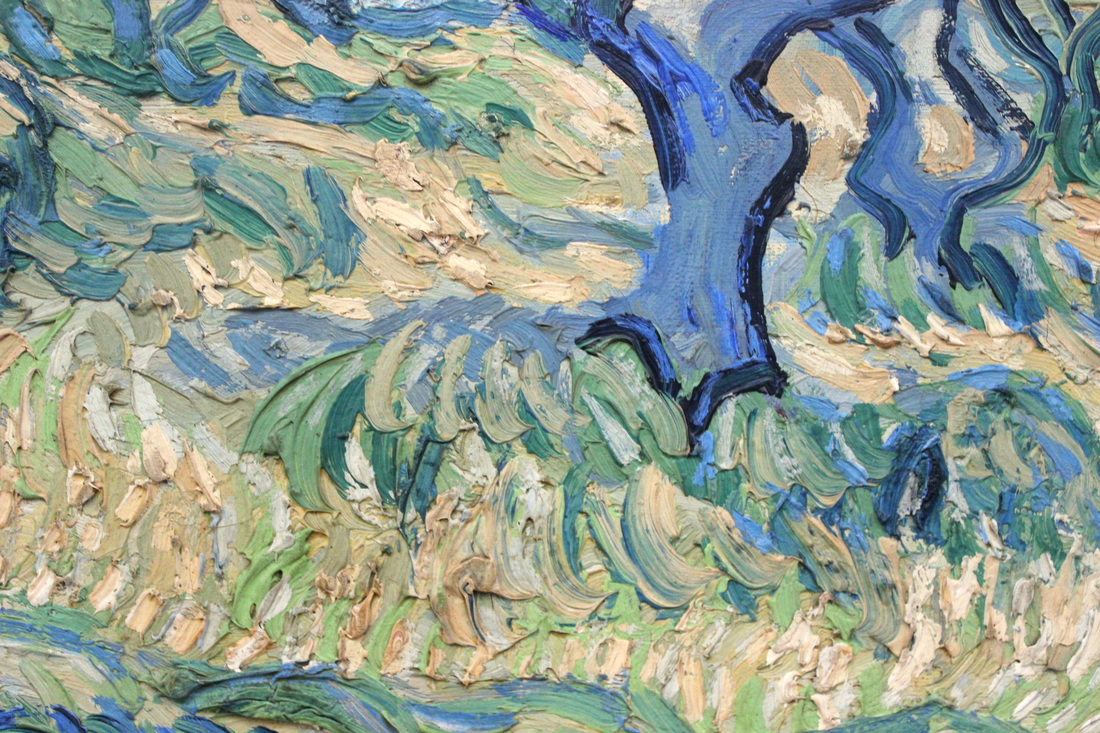
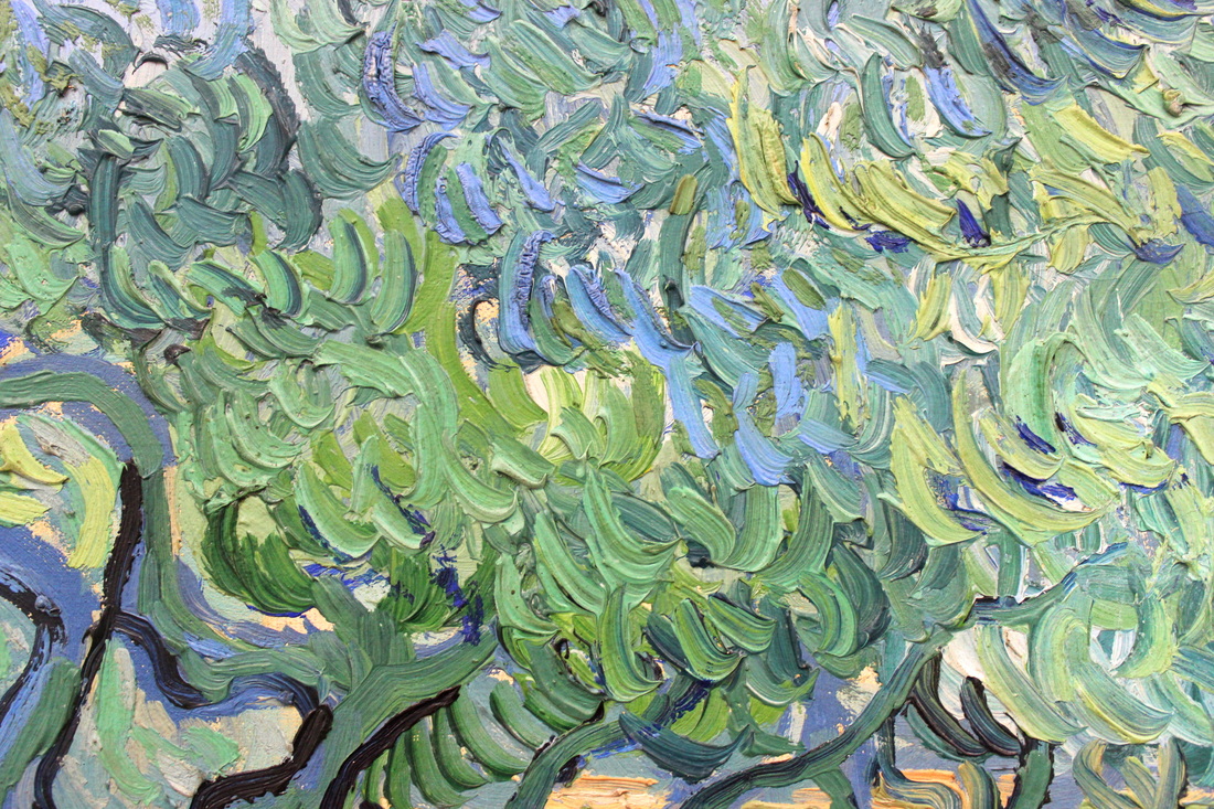
And in one wing, the van Goghs. The paintings are laid out chronologically, and feature a lot of early van Gogh. There are examples of the first still-life paintings he produced as he was first learning to use oil paint, in 1881. And several works from 1882-1885, when he was dedicated to depicting peasant life and rural farming. The museum has The Potato Eaters and Loom with Weaver. There are also a few landscapes from this period. Boggy-dark, muted green, obedient in their depiction of reality and technique. What struck me is that, if you associate van Gogh with the most famous and reprinted works that came later, these paintings are remarkably boring. Superficially attractive in their realism, with clues to his style of painting throughout. But nothing that you might not already know about these landscapes, these scenes, these ideas. The Sower, though. I went in close to count how many shades of blue. You can see the same shades hitting the canvas in strokes that might overlap, but which never blend. He didn't smear the colours together, he laid them on. There's a layer of grey-blue strokes, a layer of pale blue strokes, a layer of purplish-lilac-blue strokes. Spattered throughout, shrill dabs of orange. Orange and blue are opposites and so in terms of seeing colour, the contrast can't be greater. And when I stepped back... everything changed. It was then I realised there's an ideal viewing distance for van Gogh's most colourful paintings. It's the point where contrast between blues and orange and yellow start working together. They sink into the eyes. And the effect is like music. Every paintstroke a beat, a note, a particular sound. Taken all together, the contrasts of colour work like a symphony. And in this painting, against everything playing out of the foreground, in the background the linear motion of the sun rays blaze outwards and set a constant tempo. Close up you see the notes, but from further away you can see the full music. And this. Far more beautiful than his titular Sunflowers, that yellowish sunny painting I was first introduced to in primary school. This is Four Sunflowers Gone to Seed. Again, close up I saw the strokes. Stepping away, I saw how everything came together to make four dying flowerheads come ablaze. Contrast. That's why I like Vincent van Gogh's style, his paintings. I have been thinking a lot about the Sublime, since interviewing Anna Dumitriu about her artwork. If we take the Sublime to mean an incredible beauty, it's something that can only be sharpened and highlighted by contrast. Orange against blue, black against white, paint contrasts etched onto canvas, a symphony of something beautiful that van Gogh saw. The painting was full of movement and direction and tempo. 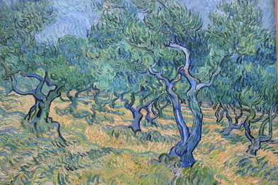 Even van Gogh's life was about contrast. Beauty and darkness, depression and mania. He could see incredible visions of the Sublime in the scenes he painted, of the countryside, of objects, of people, of streets. He painted his excitement and fervour into his works, striking out each piece into a moving orchestra of colours and brushstrokes and direction and tempo and blackness. Then there were the times of horror, of nothingness, melancholia. Perhaps the Sublime comes and goes. Like the sun, you can't stare at it forever. In between the beauty, the ordinariness, and beyond that, the complete lack of beauty. 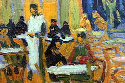 I studied van Gogh in high school. The first time I saw an exhibition of his work was as a visiting exhibition at a modern art museum in Seoul, South Korea. What struck me then was the shininess of the colourful paint, which looked almost freshly applied. The chapped texture of the brushstrokes buttering the colours on. They were famous, and old, and alive. And I'd had no idea he had created so many paintings. Like most people, I grew up on a diet of Vincent van Gogh's Sunflowers. The same image turned out and appearing in textbooks, posters, school lesson photocopies, again and again, as though on a carousel. 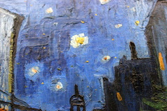 Colour has always been what I like best in paintings. Colour and contrast. Colour played against blackness to bring it out and make it breathe. Sitting in the museum, staring into a van Gogh painting, I felt an odd feeling, like a brief psychological disjunction. I was reading a message written out in paintstrokes and paintings by another long-passed artist's work. Did I feel as he had felt? Did he know what it was that he created in his work? 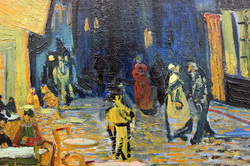 Feeling how another person feels, seeing how they see. I thought about this a lot as the museum closed and I started pedalling back through the park. Along with visual art, I have always liked science. I like to know the names of things, and why things happen. I like to see in closer and closer detail how something works, from learning about a leaf, to the cell, to the mitochondrion inside and beyond to where you can no longer see, in the diagrammatic sketching of the visualised electron transport chain. School had always been about progressing in greater and greater levels, so it's not entirely unsurprising that I studied Biology at university. Knowing these things gives me a sense of similar excitement to looking at a beautiful contrast of colours in a painting. And to step back from the details, to try and hold everything in your head at the same time as you look at the bigger picture- how the machinery of the genes moves the molecules that connect up the proteins that altogether animate the entire organism... it's bewildering, and it's incredibly difficult. That's science. But it seemed to me that trying to hold everything together like that is not so different from stepping back from a van Gogh, and finding the point where everything begins to move and work together as one. And that was why I'd become interested in science communication, too. Science communication can have many roles and they are best explored in another article. I'll define two major types of science communication here, though. One reason is to communicate clearly, to rearrange a piece of complex jargon-filled research into something legible to a non-specialist. The second reason is to make you feel as I feel. There's a beauty in science communication, because it is an art form. The way an idea is expressed, whether through words, a picture, a book, a sentence, an article, a concept. If I could create something that communicates that flash of beauty, fascination, of that Sublime in science, then I will have shared what I see in it. And that's the true point of science communication and science engagement to me. If I ever achieve that then it will mean, like van Gogh to his viewers, that I succeeded.
2 Comments
You saw Van Gogh in Seoul and didn't tell me about it!? I'm hurt. Otherwise, nice reflections, great post! It reminded me of visiting the Louisiana Museum of Modern Art outside of Copenhagen. Increasingly, I find museums like that much more pleasant than the overbearing mega-seums like MoMA or the Prado.
Reply
Annabel
9/10/2014 08:23:25 am
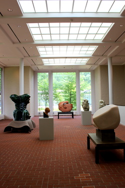
Yeah, but I didn't appreciate those van Goghs like the ones I saw at the Kroller-Muller! And I agree, a smaller and more unusually designed gallery can really boost the experience. I had a turn in London's galleries recently. The high ceilings and echoing rooms, all designed to accommodate the masses of visitors... well, it's all functional, but it's certainly not memorable. Even the Van Gogh Museum here in Amsterdam is pretty uninspired. Though they're in the middle of building a big new facade so things will change. I'll have to take a trip to Copenhagen some day soon :)
Reply
Leave a Reply. |
AuthorNot quite a blog, but things that I have written. Please note - these writings are unedited, for the purposes of flexing my fingers, and no doubt contain grammatical errors and carelessness of expression I wouldn't allow in professional writing. Categories
All
Archives
June 2021
|
 RSS Feed
